Notes A Web Component for previewing fonts
Every type foundry website needs a font tester. It’s the one piece of UI that does the most work, it’s where a potential customer actually feels a typeface rather than just seeing it.
Read moreEvery type foundry website needs a font tester. It’s the one piece of UI that does the most work, it’s where a potential customer actually feels a typeface rather than just seeing it.
Read moreLombolo is a display font that stands on the shoulders of giants, echoing the spirit of historical modular design. Combined with the possibilities of new technology, it offers multiple variable axes. Following in the footsteps of Josef Albers, Ken G…
Read moreThe design commentary echo chamber is on. Almost every voice seems to be calling depth, blur, and spatial as the future of interface.
Read moreThroughout 2023 and 2024 I’ve been building on Fountain, an e-commerce starter kit for type foundries and designers. A collection of ready-made templates and functionality, designed to help anyone kickstart their online business while still being in control of fonts and distribution.
Read moreIn 2021 I finally launched my first retail font Tranemo. A sans serif typeface in two styles with seven weights for each style. With this release, I also launched my own foundry – Nymark Type.
Read moreI just wanted to write a post. And then I discovered a small bug. And then another one. So I might as well do an entire rewrite of all javascript. And do some style updates I’ve had in the pipeline for a while. Ok, there will be a new post soon.
XXL, a Norwegian sporting goods retailer with online shop and stores in Scandinavia, recently released a design overhaul by Kurppa Hosk. For me, the logo has been a sore eye for long and I was hoping to see a fix. But I was wrong.
Instead it was di…
Read moreAs a freelance designer I work with a variety of projects and clients. Often I do consult work as UI/UX designer where the tools are already in place. This means I encounter lots of ways to organise design in artboards and components.
Read moreReading the overall good "5 Keys to Accessible Web Typography" by Matej Latin, I can’t help to point out the CSS font-smoothing part where Matej recommends anti-aliased font-smoothing for light text on dark background.
If you’re looking for a lighter text, go for a lighter weight. Font-smoothing will not work for every user, you’re just "fixing" it for the few. It has also been removed from the specification. Yes, you’ll need to load an extra weight. But variable fonts are at the horizon.
Zach Leatherman visualise font-smoothing in his post "Laissez-faire Font Smoothing and Anti‑aliasing".

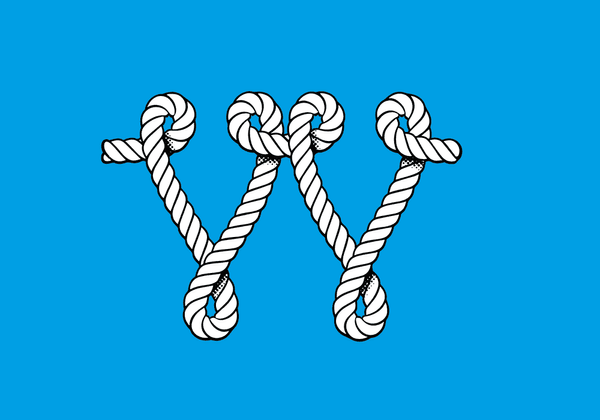
A quick illustration for a friend. A rope in the shape of two V. I wouldn’t mind if Illustrator took some inspiration how Béziers curves work in Glyphs app.