Notes Slab No. 1 status: 2
- Published
- April 16, 2015
- Written by
- Andreas Nymark
- Labeled with
- typography,font
I am currently designing my first typeface, the open-source font Slab No. 1. Here you’ll read about the process and the reasoning behind.
For the first couple of weeks it’s been a lot about getting the basics right. I’m fairly new working with Glyphs, so I’m slowly getting the grips around stuff.

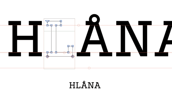
So far I’m happy with /H, /L, /A, /Å, and /N. I had some issues with /N to balance a larger lower counter compared to a smaller upper counter.
A special twist is added on the /Å since I’m both keeping the upper serif and making the ring a part of the letter. I don’t see that to often so it might be a nice flavour.
All on Github
If you’re interested or just want to feedback, the .glyphs-file is available on Github and I regularly push new updates. Slab No. 1 on Github.