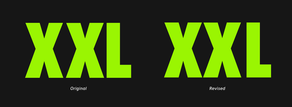
Notes We need to talk about the XXL logo
- Published
- July 8, 2021
- Written by
- Andreas Nymark
- Labeled with
- graphic design, logotype, type design
XXL, a Norwegian sporting goods retailer with online shop and stores in Scandinavia, recently released a design overhaul by Kurppa Hosk. For me, the logo has been a sore eye for long and I was hoping to see a fix. But I was wrong.
Instead it was disappointing to see the logo remained the same. I’ve got no information if the design agency was ever allowed to change it. But to get closure, I’ve fixed it myself.

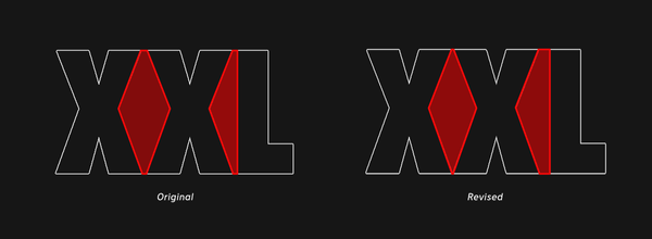
My issue with the logo is the unbalanced space between XX and XL. The amount of white space should be more equal.

To achieve this, I’ve made the space between XX as tight as possible without touching. The space between XL is increased until it feels balanced.