Work Visual design for Brillbee
- Year
- Client
- Category
- Information
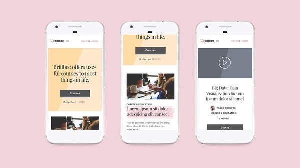
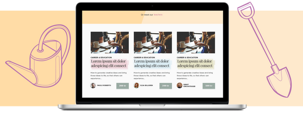
Brillbee is an online course platform from Bonnierförlagen. The range of courses targets “the aspiring do-er”. It often circle around a well-known expert within the specific area.
Each course is often an extension for one of the books released by Bonnierförlagen.

Process
I worked as a visual designer in the project. I helped bridge the gap between the user flows, the new brand and the on-going development of the platform. I did the visual design for the initial launch, in collaboration with agency F&B Factory. User experience design and course methodology was done in-house.
Design concept
The target audience for Brillbee are people attending a course for the experience, as a hobby. The name is sprung out of "being brillant" and sets a direction for tone of voice, color, and typography.
My role
I worked together with an in-house UX-designer at Bonnierförlagen. I was responsible for the visual design.